
Public information is only effective when people can find it, understand it, and act on it. That sounds simple, but audiences do not all consume information in the same way.
Some people prefer to read a detailed webpage. Others want a short video, a social media post, a printed handout, an audio explanation, or a simple visual that tells them what to do next. Many people rely primarily on a mobile phone, while others may have limited access to digital tools. Language preferences, visual or hearing needs, familiarity with the service, and the urgency of the message can all affect how information is received.
For public transportation agencies, these differences matter. Riders may be looking for route information, service changes, eligibility requirements, fare details, safety instructions, or help using a service for the first time. The information may be accurate, but if it is difficult to navigate or written in a way that feels overly technical, it may still fail the audience.
Good communication begins by looking at the experience from the user’s perspective.
What does the rider need to know first? What action should they take? What questions are likely to follow? Can the information be understood quickly on a phone? Is the most important detail buried in a long paragraph? Would a diagram, captioned video, voiceover, or printed checklist make the message easier to use?
In our work with public transportation clients, we have seen the value of developing content that can move across formats without losing its meaning. A single topic might begin as a webpage, then be adapted into a short video, social post, rider handout, or frequently asked questions section. Each version serves a different communication need, but all should deliver the same essential message.
Artificial intelligence can support this process by helping teams review content for clarity, identify complex wording, organize information, and create draft variations for different platforms. It can also help analyze user behavior, such as which pages receive the most visits, where users leave, what questions appear repeatedly, and which formats generate the strongest response.
That information can guide practical improvements. A page with heavy traffic but a high exit rate may need a clearer opening or a more visible next step. A frequently searched question may deserve its own video or graphic. A long instruction page may work better when divided into short sections with headings, illustrations, or a downloadable checklist.
However, technology should support the user experience, not define it. The final decisions still require human judgment, especially when the audience includes people with different abilities, language preferences, levels of familiarity, and access to technology.
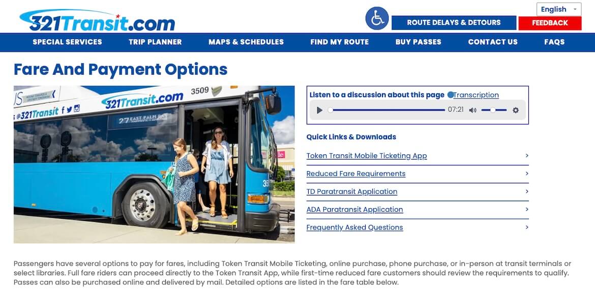
Clear public information should feel direct, respectful, and easy to use. It should avoid unnecessary jargon, present important details in a logical order, and provide more than one path to understanding when possible. Captions, transcripts, descriptive narration, readable page layouts, strong visual hierarchy, and mobile-friendly design are not extras. They are part of creating communication that works.
The best public-facing content does more than share information. It reduces uncertainty. It helps people feel confident that they understand the service and know what to do next.
Designing for the way people actually consume content leads to better engagement, fewer misunderstandings, and a more positive experience with the organization itself. When communication is built around the user, everyone benefits.